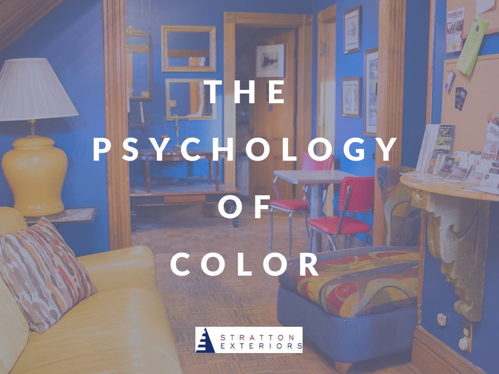
When it comes to our homes, many of us are terrified of color. After all, a bright wall color feels like a huge commitment–one that can become an eyesore in an otherwise gorgeous house.
Color has an impact on how a space feels, and how we react to it. It can transform a stuffy, boring room into a unique talking point for your house guests. Going overboard with color, however, can make a room look tacky. It can even make a space overwhelming to the eye. It’s all about choosing the color that creates the feeling you want your home to provide.
Today, we’re examining the psychology of color–and how the right color can transform your home.
Warm Colors
Warm colors–like red, yellow, brown, orange and gold–advance in a space. These colors can inspire thoughts of the sun, fire, heat or the earth. Warm colors are also often associated with food and eating. This is why oranges, browns and reds are often chosen for restaurants, kitchens and dining rooms.
Additionally, a warm color in a communal room can encourage connectivity and interaction, since we often associate food with socializing.
Overly bright warm colors, however, can be harsh on the eyes and make a person feel overstimulated.
Cool Colors
Cool colors–think blues, purples, greens, and grays–recede and create the perception of space. Cool colors, especially blue, are often described as serene and calming. Other cool colors are thought to drive inspiration or focus. Cool colors are often used in bedrooms, bathrooms, and studies, as these are places of relaxation and concentration.
Individual Color Psychology
Blue can create subconscious feelings of serenity, even somberness. Certain shades of blue have been shown to inspire creativity. Other shades inspire tranquility and restfulness.
Green particularly inspires movement and motivation. Because it’s the color most closely associated with nature, green can make a person feel energized and connected. Studies have shown that students perform better when green is incorporated into the learning environment.
Red inspires feelings of vitality and power. Painting a kitchen or dining room red can make food appear more appetizing. It can also create a more social atmosphere and encourage people to interact. Too much red, however, can be exhausting to the eye. It can also create feelings of anxiety or discomfort.
Yellow is a cheerful, inviting color. It can inspire optimism and energy. It can also create a sense of light in rooms that don’t receive much natural sunlight. Unfortunately, yellow is also the most visually tiring to the eye. This is because yellow reflects alot of light, and can cause eye strain when it’s too saturated or overwhelming. Additionally, yellow can cause anxiety. Babies tend to cry for longer periods of time in yellow rooms.
Purple: Unlike blues, greens and reds, purple is not commonly found in nature. The rarity of the color has made it a precious commodity throughout history, especially in fabric dyes and design. The effort in finding and mixing materials for purple dye was extensive–so the dye was reserved for the wealthy and royalty. In modern times, purple retains its air of wealth and sophistication.
Orange is the color most commonly associated with energy and activity. It can make people feel awake, responsive and engaged. It’s also the color associated with caution, which can make people anxious. The right tone of orange can be appetizing, energizing and engaging. The wrong shade can be overwhelming, creating feelings of anxiety.
Do you want to experiment with color in your upcoming home renovation? Stratton Exteriors can help you find the wall color that creates the mood you’re going for. Contact us today to learn more or to schedule your estimate.